
The Psychology of Color Grading: A Look at Color Theory in Action
Color isn’t just decoration—it’s emotion, atmosphere, and storytelling. In both film and branded content, color grading plays a crucial role in shaping how an audience feels. Behind the tools and technology lies something deeper: a psychological language that taps into how we perceive the world.
In this post, we explore how color theory functions as a storytelling tool—and how great filmmakers and colorists use it to their advantage.
Why Color Theory Matters in Grading
At its core, color theory is a framework for understanding how colors interact and affect human perception. It’s not new—painters and designers have relied on it for centuries—but in filmmaking, it becomes especially powerful when fused with narrative intent.
Warm tones (reds, oranges, yellows) often evoke passion, intimacy, or intensity. Cool tones (blues, greens) suggest calm, distance, or unease. The contrast between them—like the now-classic teal-and-orange combo—draws the eye and heightens visual drama.
“Color can raise the emotional temperature of a scene without a word being spoken.”
— Steven Soderbergh, director of Traffic and Contagion
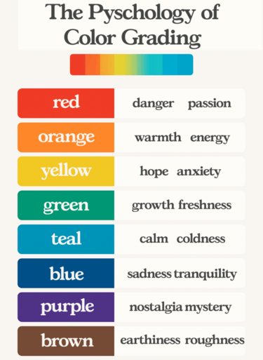
A visual guide to color psychology in film and color grading-each hue carries emotional weight that influences how audiences experience a scene.
Emotion by Design: Color as Subtext
A well-considered grade does more than make footage look good—it deepens the emotional subtext. The same frame, colored differently, can shift from nostalgic to eerie. These choices aren’t accidental; they’re rooted in psychological responses to color.
- Red can signal danger (Schindler’s List), passion (Her), or power (The Handmaid’s Tale).
- Blue can evoke melancholy (Moonlight), detachment (Drive), or tranquility (The Tree of Life).
- Yellow might suggest decay (Breaking Bad), warmth (Call Me By Your Name), or anxiety (Mid90s).
“I use color to express the subconscious. It’s not always literal—it’s emotional.”
— Wong Kar-wai, director of In the Mood for Love
How a Colorist Brings Theory to Life
As a colorist, I’m not just matching exposures—I’m crafting a visual rhythm that supports the story. Whether I’m working on a commercial or an indie film, my job is to translate tone, mood, and intent into color language.
For example, I might:
- Desaturate highlights to create a dreamy, nostalgic tone.
- Cool down shadows to introduce tension without needing a script change.
- Use split-toning to highlight emotional dualities—like warmth in skin tones against a colder environment.
It’s subtle, but powerful.
“You’re not just grading the image. You’re grading the feeling.”
— Roger Deakins, cinematographer (1917, Skyfall)
Color Theory in Commercial Work
Brands increasingly understand the psychological power of color. A lifestyle ad might lean into soft pastels to create trust and calm, while a tech campaign might favour slick, high-contrast blues to suggest innovation and precision.
In both cases, the grade reinforces brand identity, aligning aesthetics with message.
Final Thoughts: Psychology Meets Craft
Color theory is the grammar of visual storytelling. When it’s wielded with care, grading becomes more than a post-production step—it becomes an emotional amplifier.
Whether you’re making a film, a commercial, or something in between, intentional color grading can guide your audience’s emotions without a single word.
Want to explore how color can tell your story?
Let’s talk—because the right grade doesn’t just look beautiful. It feels right.
 |
|